Lighting Basic
Light is visible energy: the primal form of energy, and the measure of all energy if Einstein’s famous formula is to be believed, which states that energy is equivalent to mass multiplied by the square of the speed of light. Light is a form of electromagnetic radiation, which is visible to the human eye in a narrow band between red and blue, which lies between 400 and 800 nanometers in wavelength.
Shorter wavelengths include infrared light, longer ones ultraviolet lights. Light is what enables us to see. The human eye reacts to light in two ways: within the eye, nerve sensors, called rods, detect the intensity of light, and other sensors, called cones, analyse the colour of perceived objects into a mixture of red, yellow and blue tints. This information is transmitted to the brain, where the image of what we perceive is recreated ‘in the mind’s eye’.
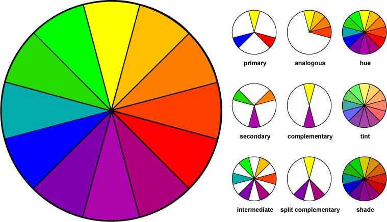 The definitions of colour are normally divided into three categories: hue – the overall colour (red, green, and orange, for example); value – the overall lightness or darkness of colour; and chroma – the strength of the colour, its degree of purity or dilution. Thus a strong dark red would be described as having red as a hue and a high chroma and value, a pale washed-out blue a hue, and a low chroma and value. Various systems exist for classifying colours along these lines, of which the Munsell system is probably the best known. This gives colours a three figure definition according to the levels of hue, chroma and value.
As to the number of visible colour, scientists suggest we can differentiate between some 40 million. In fact, since a wavelength is a ratio, not a fixed quantity, the number of colours in the visible spectrum is theoretically infinite, depending on the number of decimal places the actual wavelength is calculated to. And the number of colours an individual can distinguish depends on the receptivity of the individual’s own rods and cones, and is further conditioned by our subjective terminology for colours. One person might describe a particular colour as a greenish blue, another same colour as a very blueish green. Add to this the fact that many colours have, it is claimed, associated psychological effects, which are in turn socially conditioned, and you will realize one of the complexities of working with light: that an objective physical phenomenon that can be measured with great accuracy, is in fact subject to a range of individual, social, cultural and psychological perceptions that may vary greatly from place to place and time to time.
There is an important lesson for designers in this, that the role of lighting is not simply practical, but is affected by a range of other factors to do with the intended users’ expectations and perceptions. A successful lighting design is therefore one which not only meets the needs of the brief, but goes beyond it into defining a space in which the users’ wider needs are also met.
Sources of Light
The main source of natural light is sunlight during the day, which is delivered at night in the form of reflected light from the moon, supplemented by starlight. The effect of daylight varies with the weather, the time of day – reflecting the sun’s position in the sky – and with the geographical position of the observer, being most intense at the equator and varying in strength and colour balance according to latitude.
What may be termed ‘the daylight constant’ is an important factor in individual perception. We each have a kind of baseline perception. We each have a kind of baseline perception of what colours and appearances should be, which we recall, subconsciously, under different or impaired lighting conditions. This is important for the lighting designer, since any degree of variance from this norm will have consequences for the appreciation of any lit space for its eventual users. Sometimes this is desirable – no one wants the interior of a nightclub to be lit like a high street at midday, for example – but sometimes it is not – who wants to work in a hospital theatre lit like a nightclub? So awareness of the daylight constant is very necessary for designer.
Colour rendition
When we say that an object is red, what is actually happening is the white light falling on it is absorbed except in the red part of the spectrum, which is reflected. The wavelength of light absorbed, and the intensity of energy reflected in fact depend, in the final analysis, on the chemical composition of the lit surface. We all know for example that a shiny surface, in whatever colour, reflects more light than a matt surface in the same colour.
If there is a change in colour of the light source, then the reflected colours also change. A common example of this is the sodium lighting used on streets at night, in which the yellow light, while making shapes clearly discernible, flattens their colour range down, so that a blue object will appear black, or a white object yellow. Here our colour memory comes into play, allowing us to evaluate what we see as if it were better lit.
This phenomenon of colour rendition is extremely important for lighting designers. Different surfaces have their own colour values (the range of the colour spectrum they will absorb or reflect). They also have reflectance values (the amount of light – of whatever colour – they reflect). A wall painted in green gloss paint has a know colour value and high reflectance. The same wall covered in a green matt paint may have the same may have the same colour value with a much lower reflectance as the surface absorbs more light energy. The important variables for the designer are therefore light colour and reflectance.